
So. I've been thinking about updating the living room. I'm over the damask print and the shitty shedding rug, and the pillows have seen better days. So I started looking around for inspiration. First, I found this black and white striped rug (P.S. it's more of an off white) Then, I perused Pinterest and Etsy for additional accessories. Ikat is huge right now, so I found two black and white coordinating pillows. Then, I remembered the lovely moon print that I pinned awhile back. Through in a vintage butterfly poster and some vases and I'm done.

One of the other things I found on Pinterest was this image from Domino magazine.
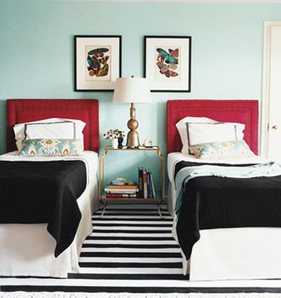 |
| Domino's Mini Guide: Twin Beds (June/July 2008 issue), photo by Justin Bernhaut via Little Green Notebook |

So. I'm putting it out there. What do you think? Family, friends, anonymous; which way should I go? Leave a comment below and let me know your favorite.